3.6.4. Plotting Data
Data in PyMoDAQ are featured with a lot of metadata, allowing their proper description and enabling seamlessly saving/loading to hdf5 files. But what about representation? Analysis? Exploration?
With Python you usually do this by writing a script and manipulate and plot your data using your favorite backend (matplotlib, plotly, qt, tkinter, …) However because PyMoDAQ is highly graphical you won’t need that. PyMoDAQ is featured with various data viewers allowing you to plot any kind of data. You’ll see below some nice examples of how to plot your PyMoDAQ’s data using the builtin data viewers.
Note
The content of this chapter is available as a notebook.
To execute this notebook properly, you’ll need PyMoDAQ >= 4.0.2 (if not released yet, you can get it from github)
3.6.4.1. Plotting scalars: Viewer0D
Scalars or Data0D data are the simplest form of data. However, just displaying numbers is somewhat lacking (in particular when one want to compare data evolution over time, or parameter change…). This is why it is important to keep track of the history of the scalar values. The Viewer0D, see below, has such an history as well as tools to keep track of the maximal reached value.
%gui qt
import numpy as np

from pymodaq.utils.plotting.data_viewers.viewer0D import Viewer0D
from pymodaq.utils.data import DataRaw

dwa = DataRaw('my_scalar', data=[np.array([10.6]), np.array([-4.6])],
              labels=['scalar1', 'scalar2'])
viewer0D = Viewer0D()
viewer0D.show_data(dwa)
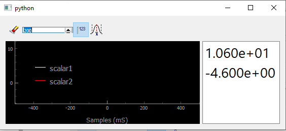
Fig. 3.69 Showing scalars in a Viewer0D
Well not much can be seen except for the numbers printed on the right
(shown by clicking on the dedicated button  ). But what if I call
several times the show_data method to display evolving signal?
). But what if I call
several times the show_data method to display evolving signal?
Note
We recall that a DataRaw is a particular case of a more generic DataWithAxes (dwa in short) having its source set to raw
for ind in range(100):
    dwa = DataRaw('my_scalar', data=[np.sin([ind / 100 * 2*np.pi]),
                                     np.sin([ind / 100 * 2*np.pi + np.pi/4])],
                 labels=['mysinus', 'my_dephased_sinus'])
    viewer0D.show_data(dwa)
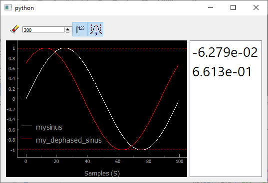
Fig. 3.70 Showing an history of scalars, together with their min and max values (dashed lines)
You immediately see the usefulness of such an history, allowing for
instance to optimize signals when tweaking a parameter especially if you
use the dashed lines, triggered by  , showing the
values of the min and max reached values.
, showing the
values of the min and max reached values.
3.6.4.2. Plotting vectors/waveforms: Viewer1D
When increasing complexity, one get one dimensional data. It has one more important metadata, its axis. Properly defining the data object will translate into rich plots:
from pymodaq.utils import math_utils as mutils
from pymodaq.utils.data import Axis

axis = Axis('my axis', units='my units', data=np.linspace(-10000, 10000, 100))

dwa1D = DataRaw('my_1D_data', data=[mutils.gauss1D(axis.get_data(), 3300, 2500),
                                    mutils.gauss1D(axis.get_data(), -4000, 1500) * 0.5],
                labels=['a gaussian', 'another gaussian'],
                axes=[axis],
                errors=[0.1* np.random.random_sample((axis.size,)) for _ in range(2)])
dwa.plot('qt')
Note
One can directly call the method plot on a data object, PyMoDAQ will determine which data viewer to use.
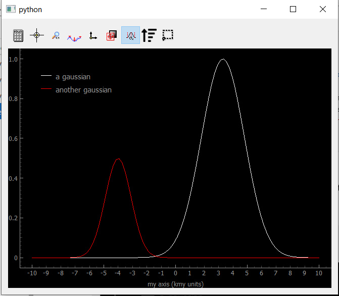
Fig. 3.71 Showing Data1D
You can see the legends correspond to the data labels, while the axis shows both the label and the units in scientific notation (notice the k before ‘my units’ standing for kilo).
As for the buttons in the toolbar (you can try them from the notebook):
 : opens the ROI (region of interest) manager, to
load, save and define ROI to apply to the data. This will create
cropped Data0D from the application of an operation on the
cropped data such as mean, sum, std… See figure below, showing
the mean value on the bottom panel. ROI can be applied to one of the
trace or to both as reflected by the legends
: opens the ROI (region of interest) manager, to
load, save and define ROI to apply to the data. This will create
cropped Data0D from the application of an operation on the
cropped data such as mean, sum, std… See figure below, showing
the mean value on the bottom panel. ROI can be applied to one of the
trace or to both as reflected by the legends : activate the crosshair (yellow vertical line) that can be
grabed and translated. The data at the crosshair position is printed
on the right of the toolbar.
: activate the crosshair (yellow vertical line) that can be
grabed and translated. The data at the crosshair position is printed
on the right of the toolbar. : fix the horizontal/vertical aspect ratio (usefull for xy
plot see below)
: fix the horizontal/vertical aspect ratio (usefull for xy
plot see below) : as shown on the figure below, one can switch between solid
line or only dots.
: as shown on the figure below, one can switch between solid
line or only dots. : when data contains two waveforms, using this button will
display them in XY mode.
: when data contains two waveforms, using this button will
display them in XY mode. : when activated, an overlay of the current data will be
depicted with a dash line.
: when activated, an overlay of the current data will be
depicted with a dash line. : if the axis data is not monotonous, data will be
represented as a scrambled solid line, using this button will reorder
the data by ascending values of its axis. See below and figure xx
: if the axis data is not monotonous, data will be
represented as a scrambled solid line, using this button will reorder
the data by ascending values of its axis. See below and figure xx : when activated, will display errors (error bars) in the form of a area around the curve
 : extra ROI that can be used independantly of the ROI manager
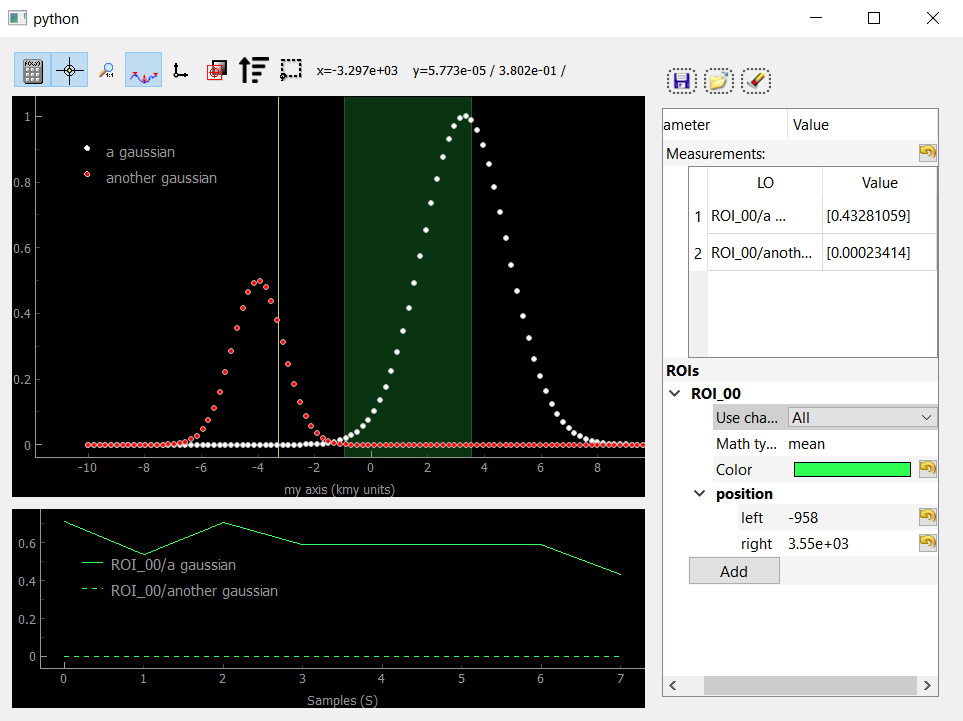
Fig. 3.72 Showing Data1D as dots and with an activated ROI and crosshair
If Uncertainty/error bars are defined in the data object, the Viewer1D can easily plot them:
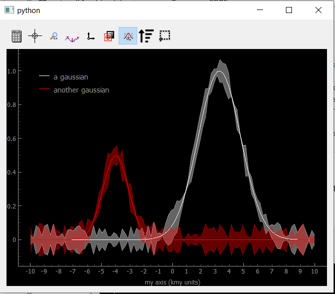
Fig. 3.73 Showing Data1D with error bars as an area around the curves.
If the axis data is not monotonous, data will be represented as a scrambled solid line, for instance:
axis_shuffled_array = axis.get_data()
np.random.shuffle(axis_shuffled_array)
axis_shuffled = Axis('my axis', units='my units', data=axis_shuffled_array)

dwa = DataRaw('my_1D_data', data=[mutils.gauss1D(axis_shuffled.get_data(), 3300, 2500),
                                  mutils.gauss1D(axis_shuffled.get_data(), -4000, 1500) * 0.5],
              labels=['a gaussian', 'another gaussian'],
              axes=[axis_shuffled])
dwa.plot('qt')
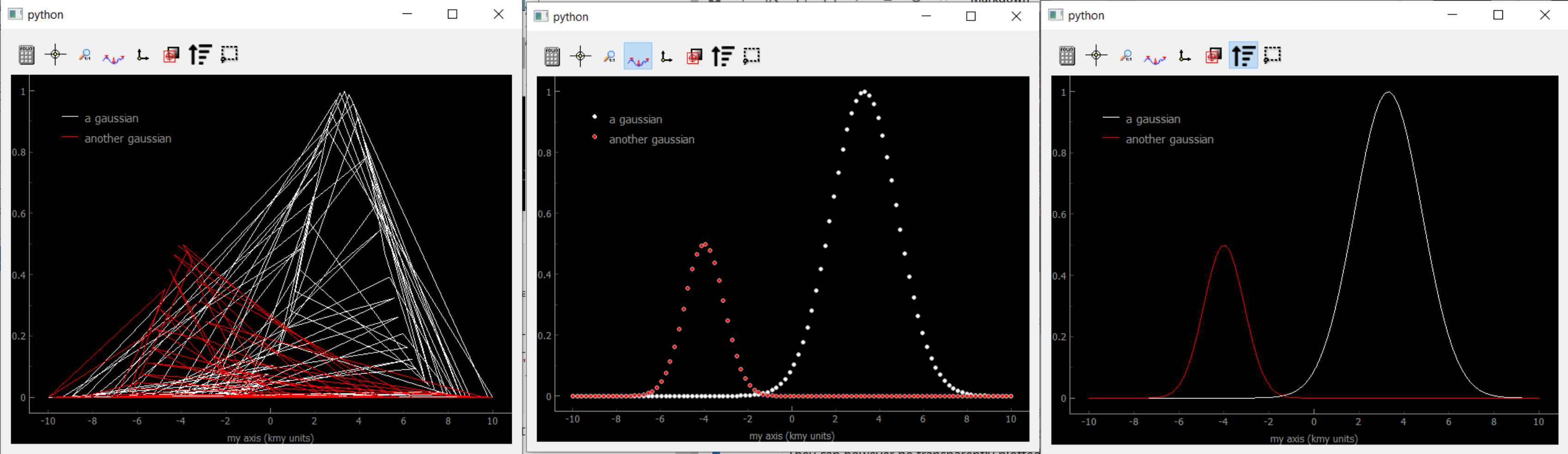
Fig. 3.74 Showing Data1D Spread. The scrambled lines (left) still represents Gaussians, it is just that the random ordering scrambled the lines. If one remove the lines by clicking the dot only button, the Gaussians reappear (middle). They reappear also after pressing the sort button (right).
3.6.4.3. Plotting 2D data
2D data can be either an image (pixels on a regular grid) or a collection of scalars with XY coordinates. PyMoDAQ introduce therefore the notion of “uniform” data for the former and “spread” data for the later. They can however be transparently plotted on the same Viewer2D data viewer. One will first show both cases before discussing the Viewer2D toolbar.
3.6.4.3.1. Uniform data
Let’s generate data displaying 2D Gaussian distributions:
# generating uniform 2D data
NX = 100
NY = 50
x_axis = Axis('xaxis', 'xunits', data=np.linspace(-20, 20, NX), index=1)
y_axis = Axis('yaxis', 'yunits', data=np.linspace(20, 40, NY), index=0)

data_arrays_2D = [mutils.gauss2D(x_axis.get_data(), -5, 10, y_axis.get_data(), 25, 2) +
                  mutils.gauss2D(x_axis.get_data(), -5, 5, y_axis.get_data(), 35, 2) * 0.01,
                 mutils.gauss2D(x_axis.get_data(), 5, 5, y_axis.get_data(), 30, 8)]
data2D = DataRaw('data2DUniform', data=data_arrays_2D, axes=[x_axis, y_axis],
                labels=['red gaussian', 'green gaussian'])
data2D.plot('qt')
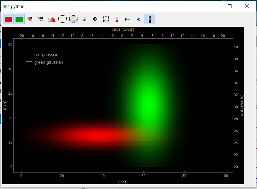
Fig. 3.75 Showing uniform Data2D
The bottom and left axes correspond to the image pixels while the right and top ones correspond to the real physical axes defined in the data object. When several arrays are included into the data object, they will be displayed as RGB layers. Data visibility can be set using the red/green (blue) buttons. If only one array is used, the color will be white.
3.6.4.3.2. Spread Data
Spread 2D data are typically what you get when doing a Spread or Tabular 2D scan, see Scanner. By the way, Spread or Tabular 1D scan would typically give the scrambled plot on figure Fig. 3.74. Let’s generate and plot such 2D data
# generating Npts of spread 2D data
N = 100
x_axis_array = np.random.randint(-20, 50, size=N)
y_axis_array = np.random.randint(20, 40, size=N)

x_axis = Axis('xaxis', 'xunits', data=x_axis_array, index=0, spread_order=0)
y_axis = Axis('yaxis', 'yunits', data=y_axis_array, index=0, spread_order=1)

data_list = []
for ind in range(N):
    data_list.append(mutils.gauss2D(x_axis.get_data()[ind], 10, 15,
                                    y_axis.get_data()[ind], 30, 5))
data_array = np.squeeze(np.array(data_list))

data2D_spread = DataRaw('data2DSpread', data=[data_array],
                         axes=[x_axis, y_axis],
                         distribution='spread',
                         nav_indexes=(0,))
data2D_spread.plot('qt')
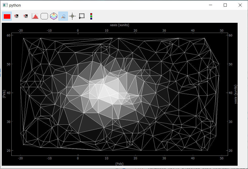
Fig. 3.76 Showing Data2D Spread. Each point in the spread collection is a vertex in the mesh while the color of the triangle is given by the mean of the three vertex.
If we go back to the construction of the data object, you may have noticed the introduction of a nav_indexes parameter and a distribution parameter. The latter is usually and by default equal to uniform but here we have to specify that the data will be a collection of spread points.
By construction, spread data have navigation axes, the coordinates of the points (note that the scalar points in our example could also be Data1D or Data2D points, we’ll see that with the ViewerND) and specifying the distribution to spread allows PyMoDAQ to handle this properly compared to the uniform case.
But then, the parameter nav_indexes is used to specify which dimension of the data array will be considered navigation, the rest beeing signal. However in our collection, the shape of the data is only (100,) so nav_indexes is (0, ). But still, we do have two axes: the X and Y coordinates of our points… To handle this, the Axis object has to include a new parameter, the spread_order specifying which axis corresponds to which coordinate but both refering to the same navigation dimension of the data.
3.6.4.3.3. Toolbar
As for the buttons in the toolbar (you can try them from the notebook):
 : Show/Hide the corresponding data
 : Autoscale on the color scale (between 0 and max or between
-max and max)
: Autoscale on the color scale (between 0 and max or between
-max and max) : display the histogram panel, allowing manual control of the
colors and color saturation. See figure below.
: display the histogram panel, allowing manual control of the
colors and color saturation. See figure below. : Open the ROI manager allowing to load, save and define
rectangular of elliptical regions of interest. Each of these ROI will
produce Data1D data (lineouts by vertical and horizontal
application of a mathematical function: mean, sum… along horizontal
or vertical axis of the ROI) and Data0D by application of the
same mathematical function along both axes of the ROI.
: Open the ROI manager allowing to load, save and define
rectangular of elliptical regions of interest. Each of these ROI will
produce Data1D data (lineouts by vertical and horizontal
application of a mathematical function: mean, sum… along horizontal
or vertical axis of the ROI) and Data0D by application of the
same mathematical function along both axes of the ROI. : shows an isocurve specified by the position of a green line
on the histogram
: shows an isocurve specified by the position of a green line
on the histogram : set the aspect ratio to one
 : activate the crosshair (see figure below)
 : extra rectangular ROI that can be used independently of the
ROI manager
: extra rectangular ROI that can be used independently of the
ROI manager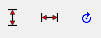 : flip or rotate the image
 : show/hide the legend (see figure below)
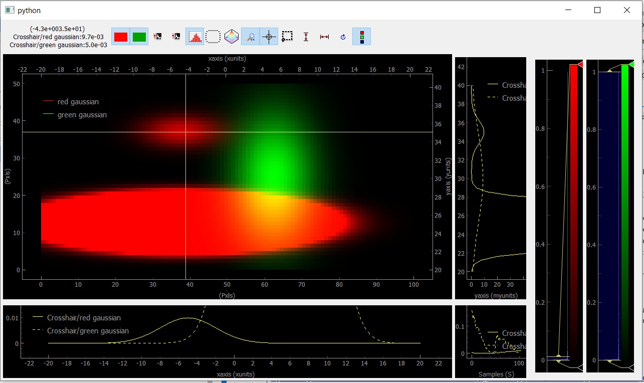
Fig. 3.77 Viewer2D with toolbar buttons activated and image saturation from the histogram.
On figure Fig. 3.77, the histogram has been activated and we rescaled the red colorbar to saturate the red plot and make the tiny Gaussian that was hidden to appear. We also activated the crosshair that induced the plotting of Data1D (taken for both channel along the crosshair lines) and Data0D (at the crosshair position and plotted on the bottom right).
3.6.4.4. Plotting all other data
All data that doesn’t fit the explanations above should be plotted using the ViewerND. This viewer is a combination of several Viewer0D, Viewer1D and Viewer2D allowing to plot almost any kind of data. The figure below shows the basic look of the ViewerND. It consists in a Navigation panel and a Signal panel, dealing with the notion of signal/navigation, see DataND.
from pymodaq.utils.plotting.data_viewers.viewerND import ViewerND
viewerND = ViewerND()
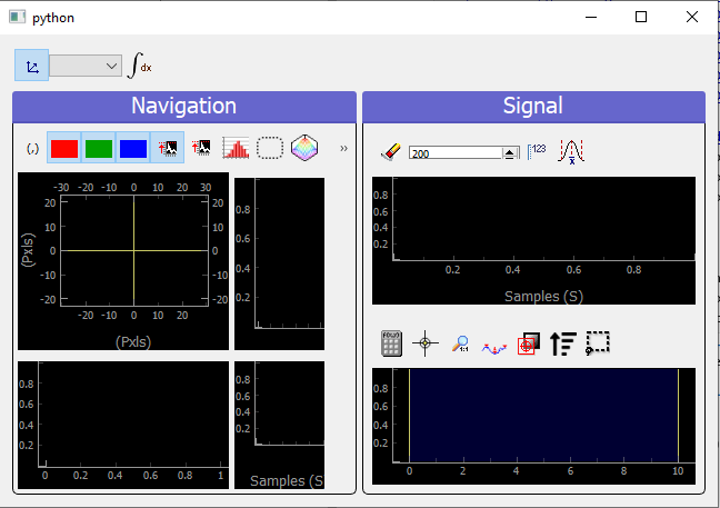
Fig. 3.78 An empty ViewerND
Not much yet to say about it, but let’s load some complex data and plot it with this viewer. For the first example, we’ll get tomographic data (3D) from the human brain. We’ll get that from the Statistical Parametric Mapping software website hosted here.
import tempfile
from pathlib import Path
import zipfile
from urllib.request import urlretrieve
import nibabel

# Create a temporary directory
with tempfile.TemporaryDirectory() as directory_name:
    directory = Path(directory_name)
    # Define URL
    url = 'http://www.fil.ion.ucl.ac.uk/spm/download/data/attention/attention.zip'

    # Retrieve the data, it takes some time
    fn, info = urlretrieve(url, directory.joinpath('attention.zip'))

    # Extract the contents into the temporary directory we created earlier
    zipfile.ZipFile(fn).extractall(path=directory)

    # Read the image
    struct = nibabel.load(directory.joinpath('attention/structural/nsM00587_0002.hdr'))

    # Get a plain NumPy array, without all the metadata
    array_3D = struct.get_fdata()

dwa3D = DataRaw('my brain', data=array_3D, nav_indexes=(2,))
dwa3D.create_missing_axes()

viewerND.show_data(dwa3D)  # or just do dwa3D.plot('qt')
Fig. 3.79 Showing brain 3D data on a ViewerND
Here you now see the image of the brain (signal part) at a certain height (12.17, navigation part) within the skull. The signal data is taken at the height corresponding to the crosshair vertical line within the navigation panel. Moving it laterally will display a different brain z-cut. The navigation 1D plot is calculated from the white ROI on the signal panel, applying the mathematical function to it (here mean see on top of the plot) and displaying this for all z-cut on the navigation panel. Therefore, moving this ROI will change the printed navigation plot. Another widget (on the left) displays information on the data: its shape and navigation/signal dimensions. From this, one can also change which axes are navigation (here this is axis 2 as specified when the data object has been constructed). In the notebook, you can change this, selecting one, two or even the three indexes and see how it’s impacting on the ViewerND.
Some buttons in the toolbar can be used to better control the data exploration:
 : opens a side window to control navigation axes
 : select which mathematical operator to apply to the signal
ROI in order to plot meaningfull navigation data
: select which mathematical operator to apply to the signal
ROI in order to plot meaningfull navigation data : if activated, another signal plot will be generated
depicting not the data indexed at the position of the crosshair but
integrated over all navigation axes
: if activated, another signal plot will be generated
depicting not the data indexed at the position of the crosshair but
integrated over all navigation axes
Signal data dimension cannot exeed 2, meaning you can only plot signal that are Data0D, Data1D or Data2D which make sense as only this kind of data are produced by usual detectors. On the navigation side however, on can have as many navigation axes as needed. Below you’ll see some possibilities.
3.6.4.4.1. Uniform Data
Le’ts first create a 4D Data object, we’ll then see various representations as a function of its navigation indexes
x = mutils.linspace_step(-10, 10, 0.2)
y = mutils.linspace_step(-30, 30, 1)
t = mutils.linspace_step(-100, 100, 2)
z = mutils.linspace_step(0, 50, 0.5)

data = np.zeros((len(y), len(x), len(t), len(z)))
amp = np.ones((len(y), len(x), len(t), len(z)))
for indx in range(len(x)):
    for indy in range(len(y)):
        data[indy, indx, :, :] = amp[indy, indx] * (
                mutils.gauss2D(z, 0 + indx * 1, 20,
                               t, 0 + 2 * indy, 30)
                + np.random.rand(len(t), len(z)) / 5)

dwa = DataRaw('NDdata', data=data, dim='DataND', nav_indexes=(0, 1),
              axes=[Axis(data=y, index=0, label='y_axis', units='yunits'),
                    Axis(data=x, index=1, label='x_axis', units='xunits'),
                    Axis(data=t, index=2, label='t_axis', units='tunits'),
                    Axis(data=z, index=3, label='z_axis', units='zunits')])

dwa.plot('qt')
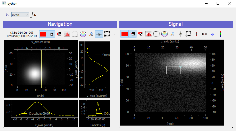
Fig. 3.80 Showing 4D uniform data on a ViewerND with two navigation axes
We use here (but it’s done automatically from the metadata) two Viewer2D to plot both navigation and signal data. If we increase the number of navigation axes, it is no more possible to use the same approach.
dwa.nav_indexes = (0, 1, 2)
dwa.plot('qt')
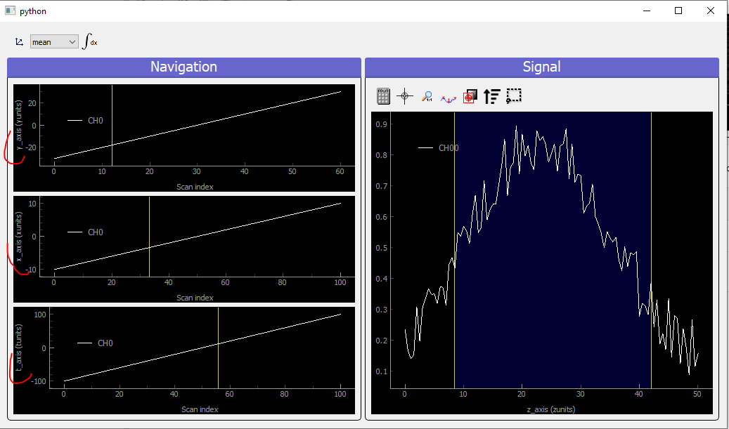
Fig. 3.81 Showing 4D uniform data on a ViewerND with three navigation axes
In that case where there are three (it could be any number >2) navigation axes. Each axis is plotted into a dedicated viewer together with a vertical yellow line allowing to index (and slice) data at this position, updating accordingly the depicted signal data
3.6.4.4.2. Spread Data
For Spread data, things are different because all navigation axes have the same length (they are the ND-coordinates of the signal data), they can therefore be plotted into the same Viewer1D:
N = 100

x = np.sin(np.linspace(0, 4 * np.pi, N))
y = np.sin(np.linspace(0, 4 * np.pi, N) + np.pi/6)
z = np.sin(np.linspace(0, 4 * np.pi, N) + np.pi/3)

Nsig = 200
axis = Axis('signal axis', 'signal units', data=np.linspace(-10, 10, Nsig), index=1)
data = np.zeros((N, Nsig))
for ind in range(N):
     data[ind,:] = mutils.gauss1D(axis.get_data(), 5 * np.sqrt(x[ind]**2 + y[ind]**2 + z[ind]**2) -5 , 2) + 0.2 * np.random.rand(Nsig)

dwa = DataRaw('NDdata', data=data, distribution='spread', dim='DataND', nav_indexes=(0,),
              axes=[Axis(data=x, index=0, label='x_axis', units='xunits', spread_order=0),
                    Axis(data=y, index=0, label='y_axis', units='yunits', spread_order=0),
                    Axis(data=z, index=0, label='z_axis', units='zunits', spread_order=0),
                   axis])

dwa.plot('qt')
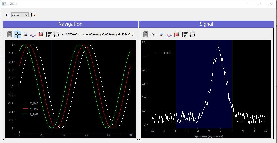
Fig. 3.82 Showing 4D spread data on a ViewerND
In that case, the navigation panel is showing on the same Viewer1D all navigation spread axes (coordinates), while the signal panel shows the signal data at the index corresponding to the yellow line.
3.6.4.5. Plotting multiple data object: ViewerDispatcher
In PyMoDAQ, mixed data are often generated, for instance when using ROI on 2D data, lineouts (Data1D) will be generated as well as Data0D. A dedicated object exists to handle them: the DataToExport or dte in short. Well if such an object exists, a dedicated plotter should also exist, let’s see:
from pymodaq.utils.data import DataToExport

dte = DataToExport('MyDte', data=[dwa1D, dwa3D])
dte.plot('qt')
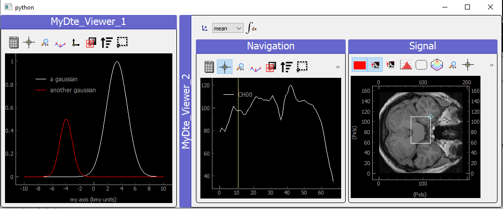
Fig. 3.83 Showing DataToExport on a ViewerDispatcher
Such an object is a ViewerDispatcher:
from pymodaq.utils.plotting.data_viewers.viewer import ViewerDispatcher
It allows to generate on the fly Docks containing a data viewers adapted to the particular dwa is contains. Such a dispatcher is used by the DAQ_Viewer and the DAQ_Scan to display your data!